Pop Art Interior Design: Bold Art, Color and Mid-Century Furniture
See how bold Pop Art artwork, saturated color and Mid-Century furniture can create a confident room that still feels easy to live in.
What Defines Pop Art?
Pop Art challenged the traditional separation between fine art and popular culture. Artists such as Andy Warhol, Roy Lichtenstein and Tom Wesselmann incorporated imagery from advertisements, consumer products, celebrities and comic books into their work.
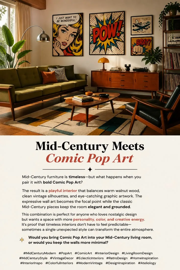
Translated into interior design, this creates a distinctive visual language: strong colors, graphic shapes, oversized artwork and unexpected combinations.
Unlike minimalism, Pop Art does not try to make every element disappear into a harmonious background. Individual objects are allowed to demand attention.
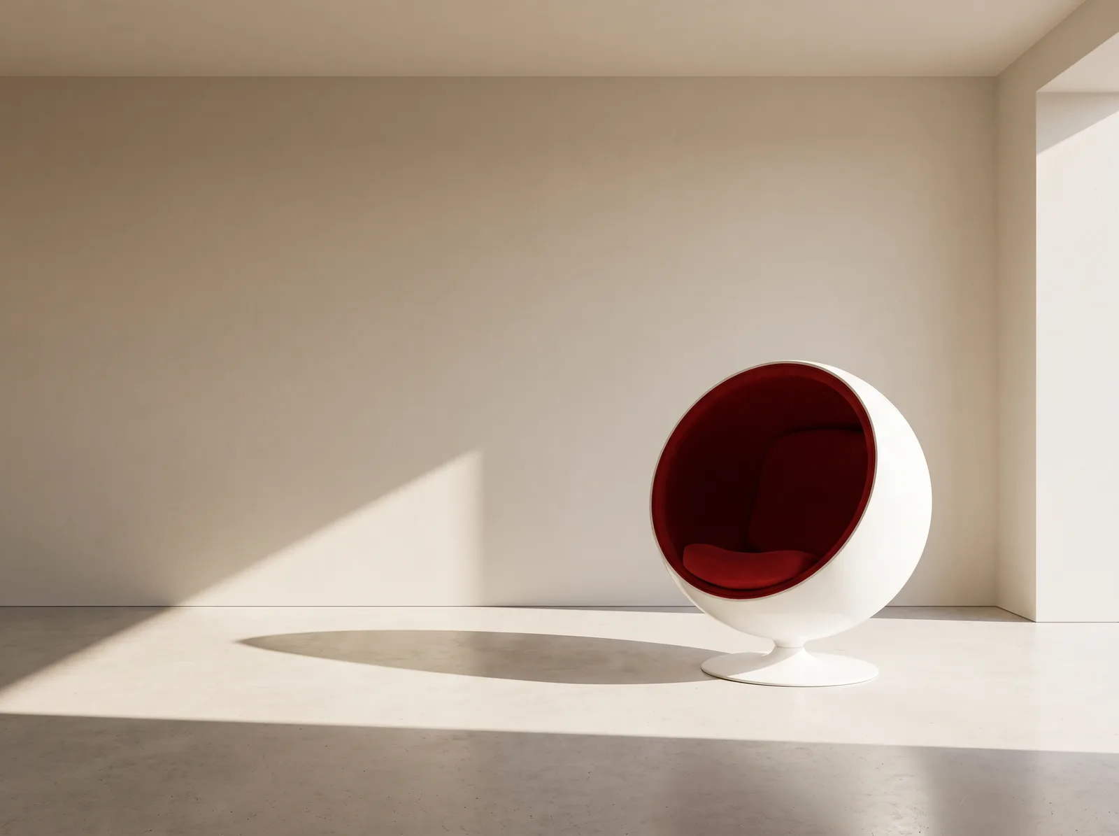
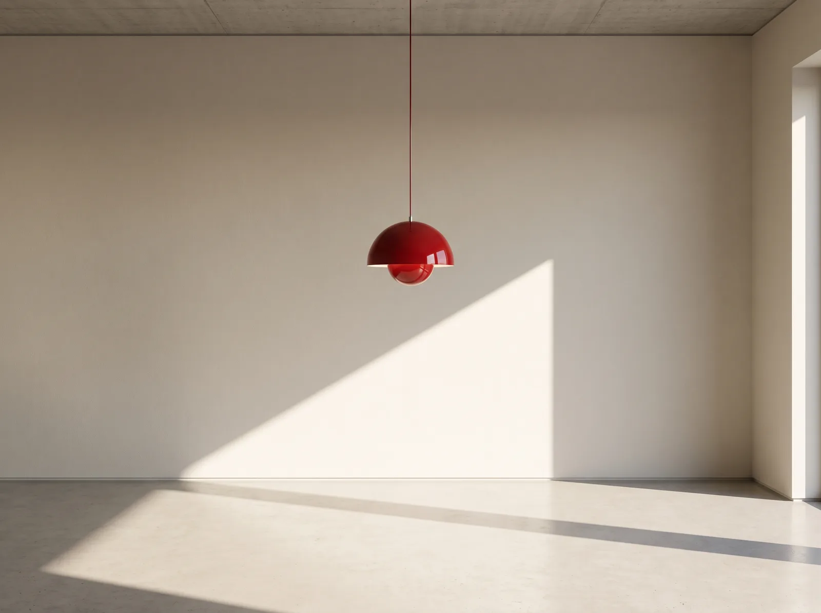
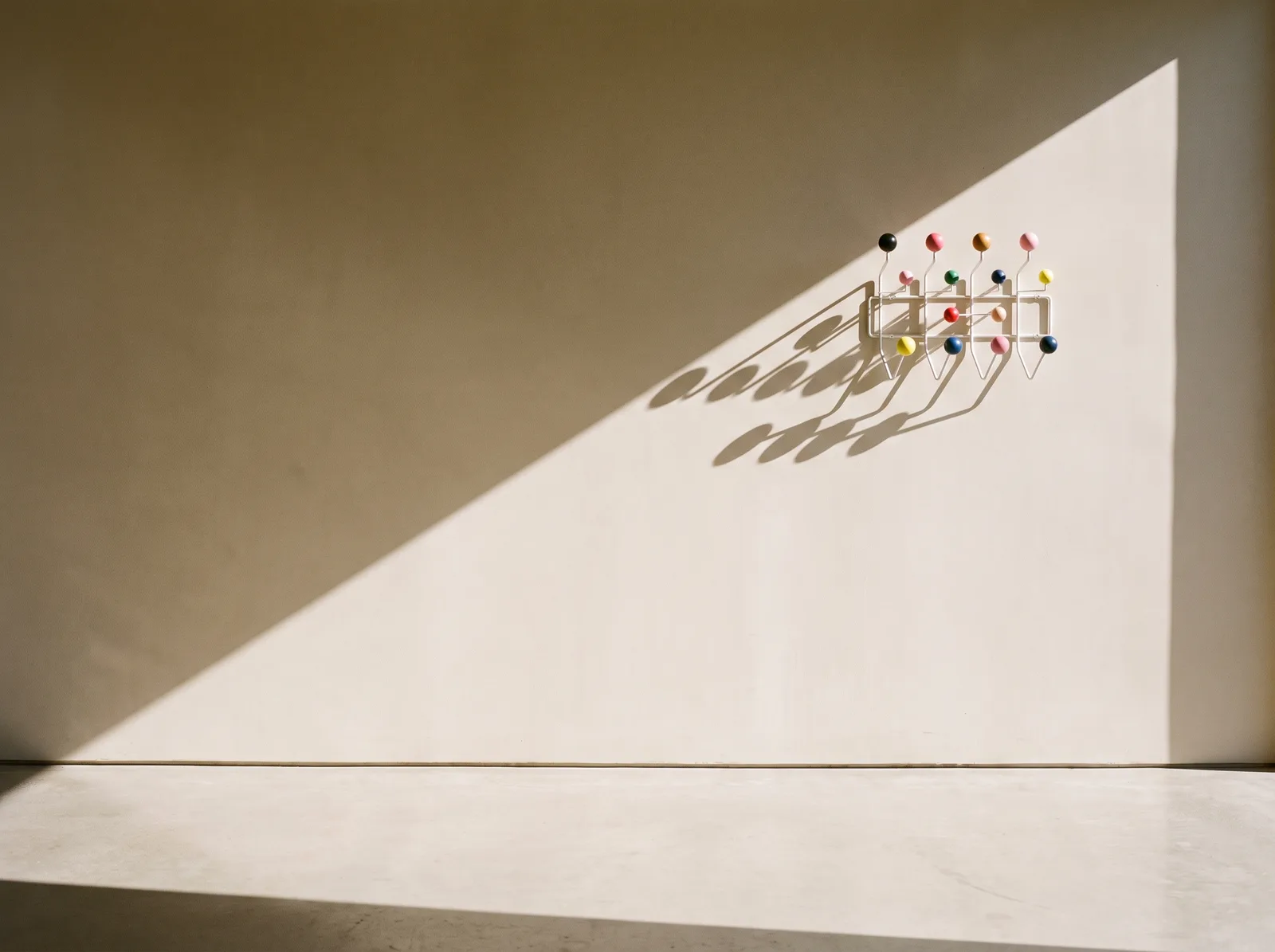
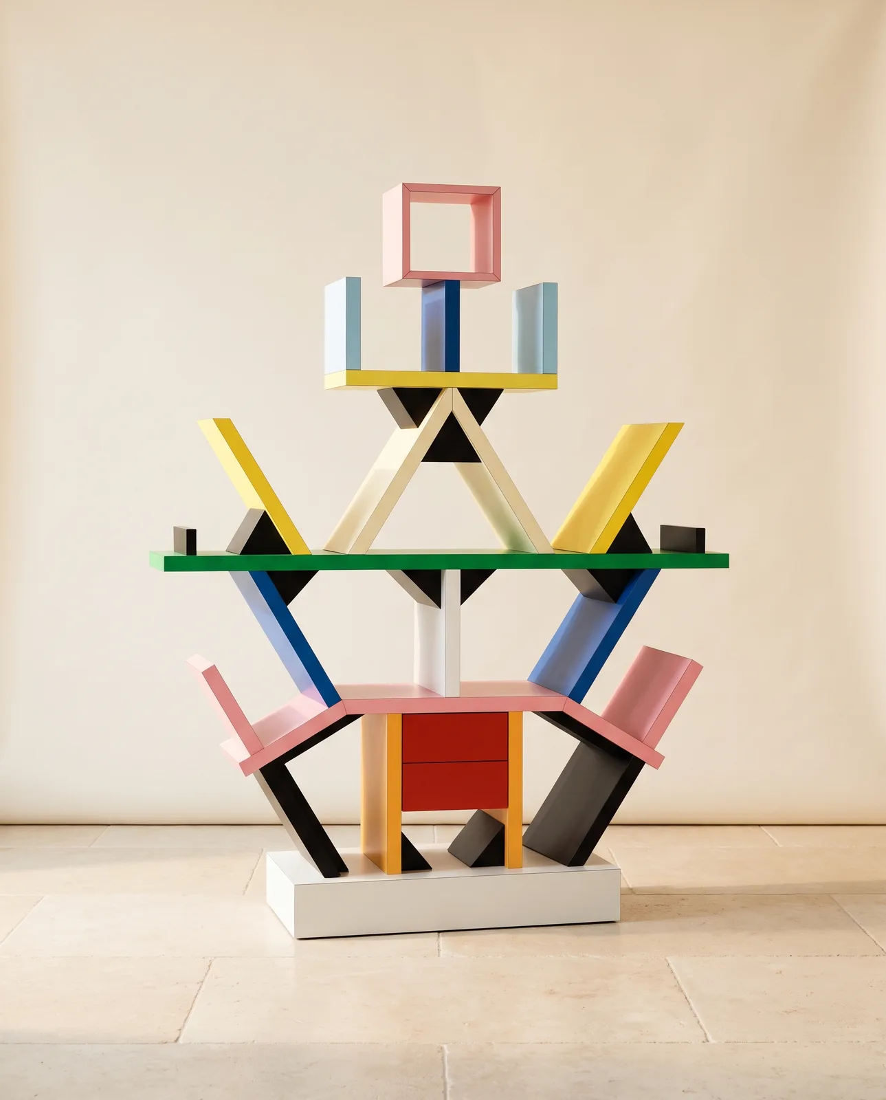
A bright red chair can sit beside a cobalt-blue cabinet. An oversized graphic print can dominate an otherwise simple wall. A sculptural lamp can become an artwork of its own.
The goal is controlled visual impact rather than perfect uniformity.
Color Is the Foundation
Color is perhaps the most recognizable element of a Pop Art interior.
Primary colors such as red, yellow and blue are particularly characteristic, but contemporary interpretations can extend far beyond them. Electric green, orange, pink, purple and turquoise can all become part of the palette.
However, a Pop Art room does not need every color simultaneously.
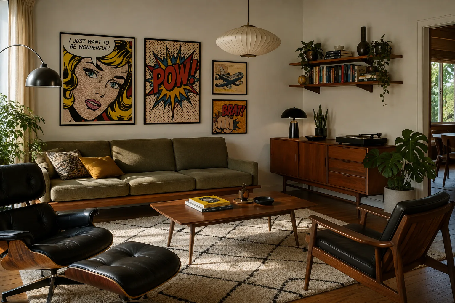
One effective approach is to create a relatively neutral architectural foundation and introduce two or three highly saturated accent colors through furniture, artwork and accessories. White walls, for example, provide enough visual space for colorful objects to become dramatically more prominent.
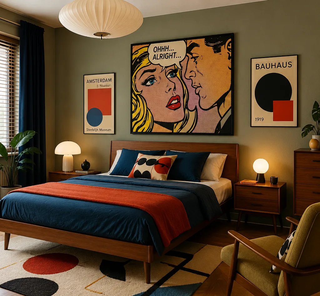
Furniture as Art
Pop Art works particularly well with furniture that has a strong silhouette.
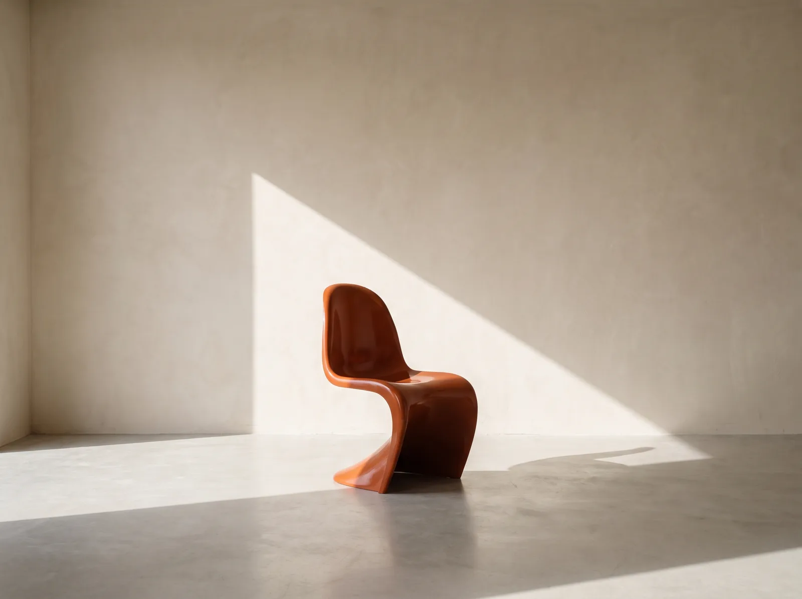
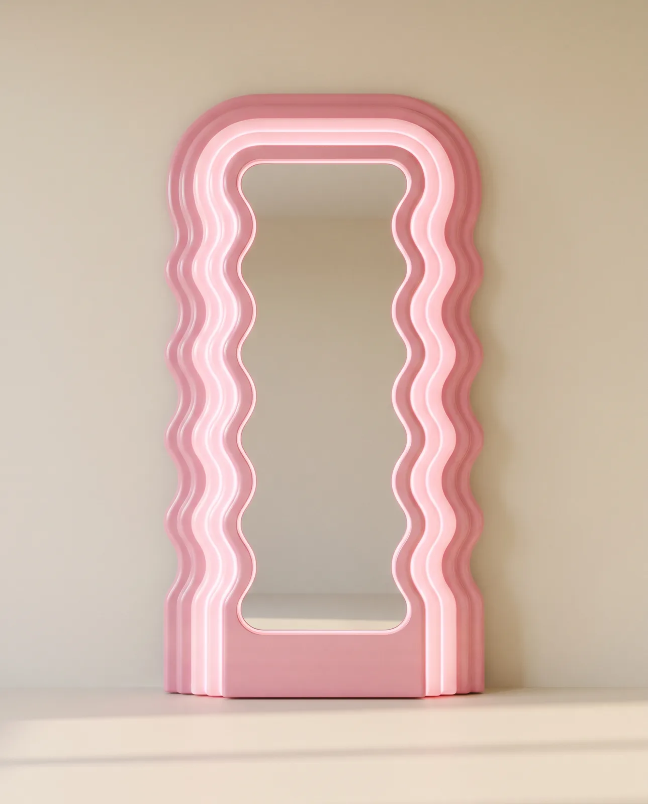
Curved sofas, glossy side tables, molded plastic chairs and unconventional lighting can introduce the playful optimism associated with the style. Designs influenced by the Space Age and Mid-Century Modern eras are especially compatible because these movements developed during overlapping periods.
Materials can be equally expressive. Chrome, colored glass, lacquered surfaces, plastic and high-gloss finishes contrast beautifully with textiles and traditional wooden furniture.
The result does not need to resemble a museum dedicated to the 1960s. Contemporary furniture can provide structure while a handful of vintage-inspired pieces establish the Pop Art identity.
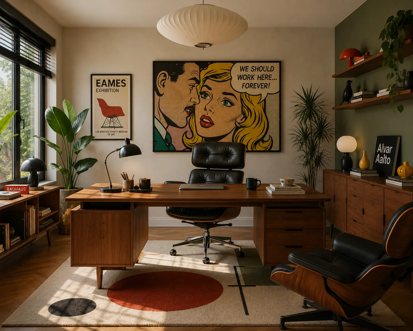
Art Should Take Center Stage
In few interior styles is artwork as important as it is in Pop Art.
Large graphic prints, comic-inspired illustrations, colorful typography and reinterpretations of familiar objects can become focal points. Scale matters: one oversized artwork can often create more impact than numerous small decorations.
This makes Pop Art particularly suitable for people who want their home to communicate personality.
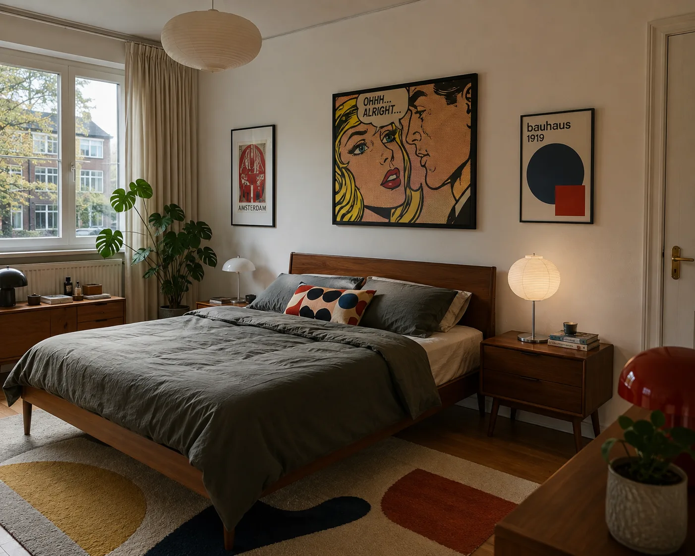
How to Keep Pop Art Sophisticated
The biggest challenge is avoiding visual chaos.
A sophisticated Pop Art interior needs contrast and restraint. If the sofa, rug, walls, artwork and every accessory compete for attention simultaneously, individual pieces lose their impact.
Instead, establish a hierarchy.
Choose several statement elements and give them space. Combine saturated colors with neutral areas. Repeat selected colors throughout the room to create visual connections.
The result can be playful without looking childish and colorful without becoming chaotic.
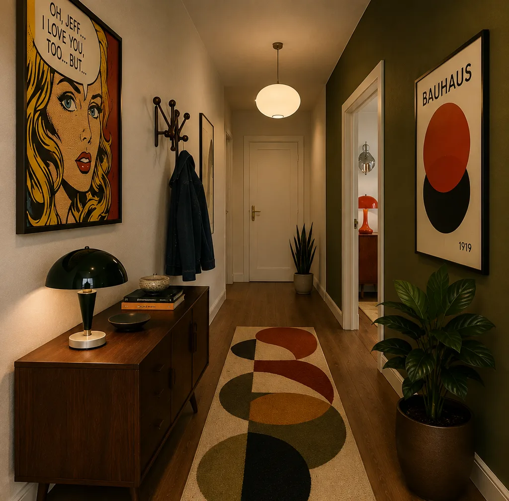
Ultimately, Pop Art is about rejecting the idea that a sophisticated interior has to be quiet.
A home can be bold, humorous, colorful and unexpected — and still feel carefully designed.
Ateliology
Interior Design · Furniture Icons · Style Guides