Japandi Wall Art: Why Less on the Wall Can Do So Much More for a Room
Which artwork suits a Japandi room? Explore quiet motifs, complementary colors and simple ways to connect art with your furniture.
Why Japandi Wall Art Looks So Calm
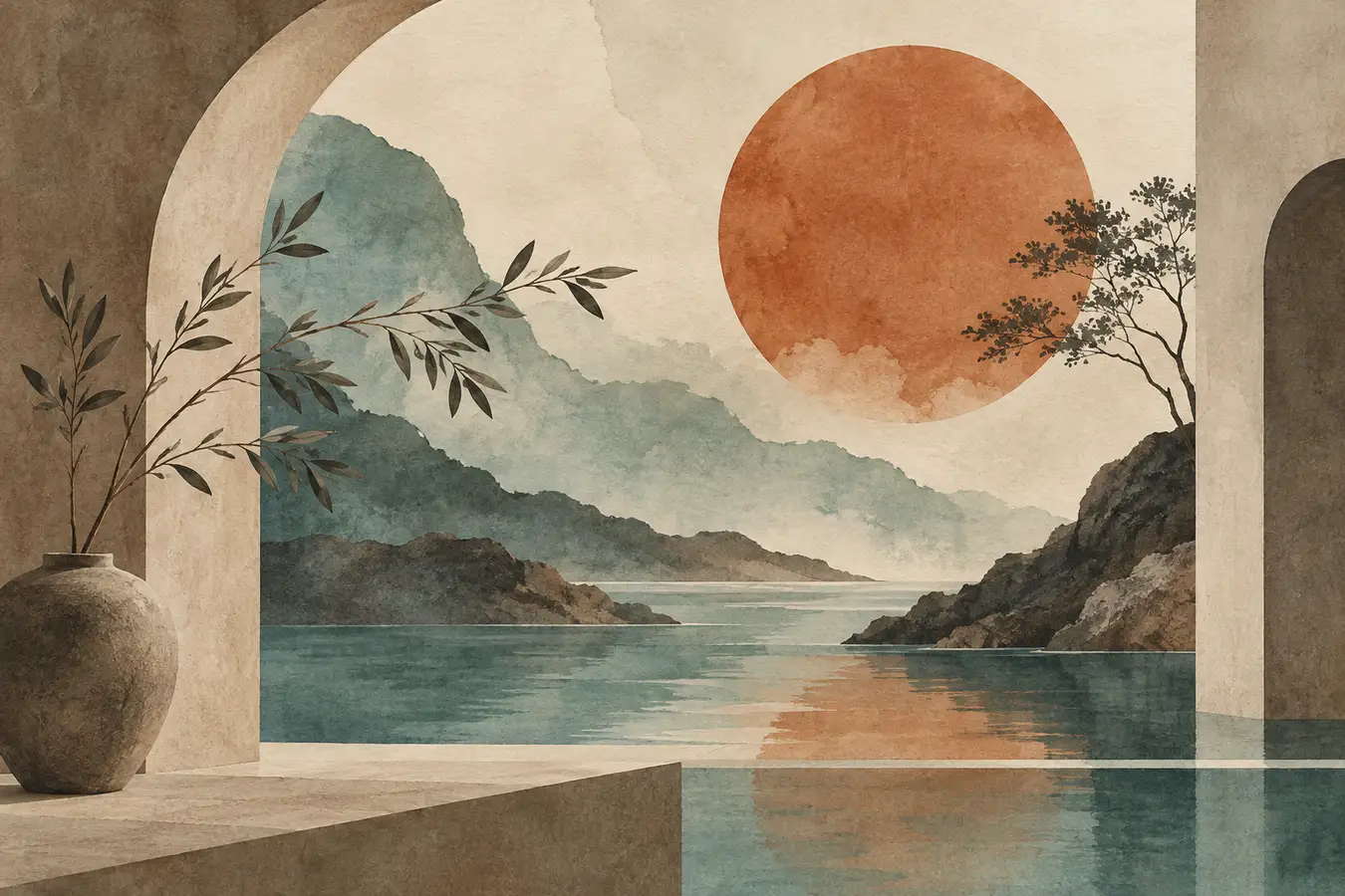
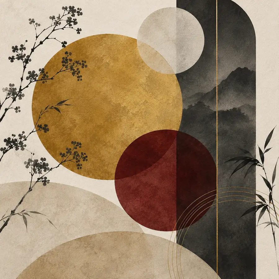
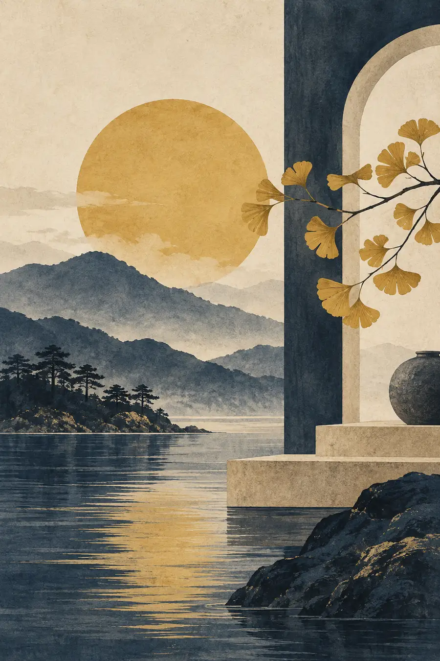
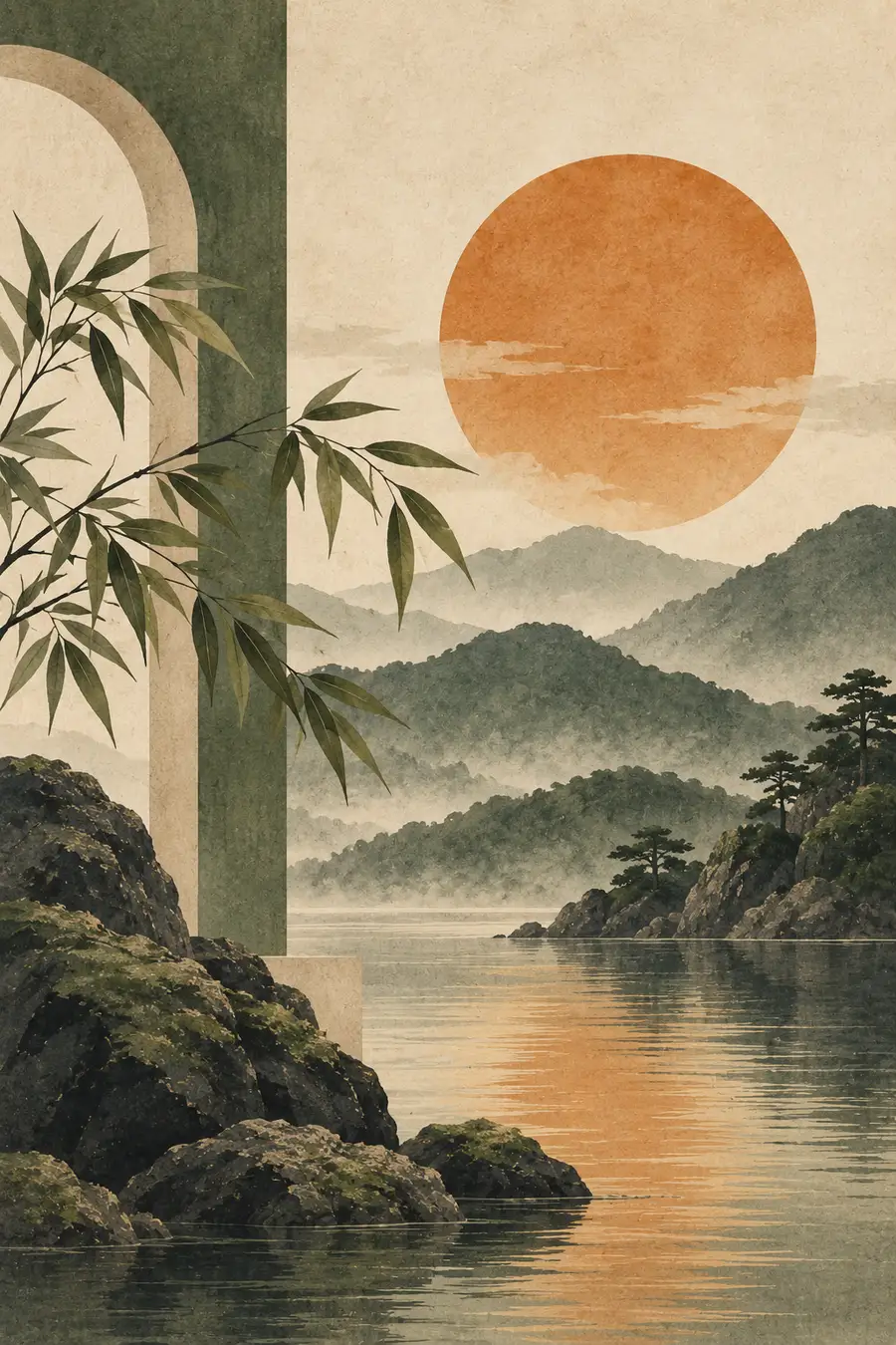
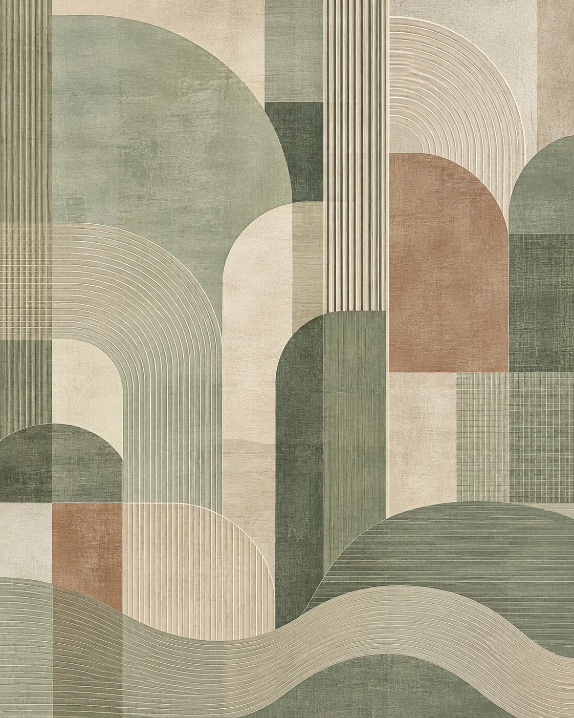
Look at typical Japandi prints and you keep meeting the same handful of elements: circles, arches, flat shapes, thin lines, soft landscapes, abstracted plant forms, and colors like beige, greige, sage, brown or cream.
That's not a lack of imagination.
These motifs work because they don't keep your eye constantly busy. A painting with ten colors, five people, three dogs and a Venetian street scene tells a story. A Japandi print sometimes tells you only: circle. line. beige.
And in a room, that can be exactly right.
Our homes are already full of information. Furniture, books, lamps, rugs, electronics, kitchen utensils, windows, doors, and somewhere a router is probably blinking. Wall art doesn't necessarily need to add another layer of visual noise on top of that.
Japandi wall art can instead create a kind of visual pause.
A large calm surface gives the eye time. A single arch provides structure. A thin line creates direction. Two slightly overlapping shapes create depth without shouting for attention.
That's exactly the trick.
The Art of Apparent Simplicity
A good minimalist image is surprisingly hard to design.
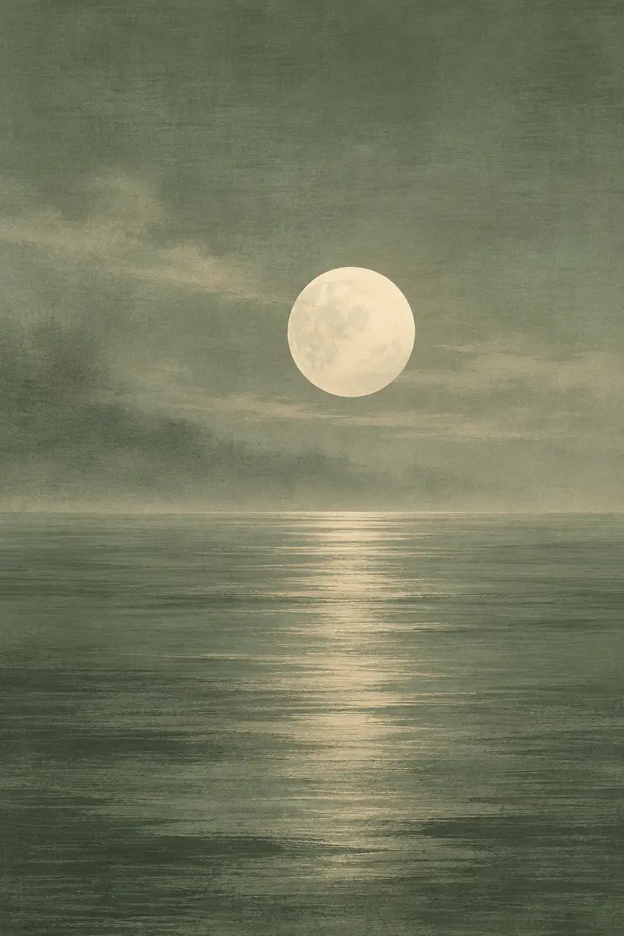
When a painting is made of a hundred details, one weaker element can disappear somewhere among the others. When an image consists of only three shapes, every wrong proportion is immediately obvious.
That's why Japandi art is so much about balance.
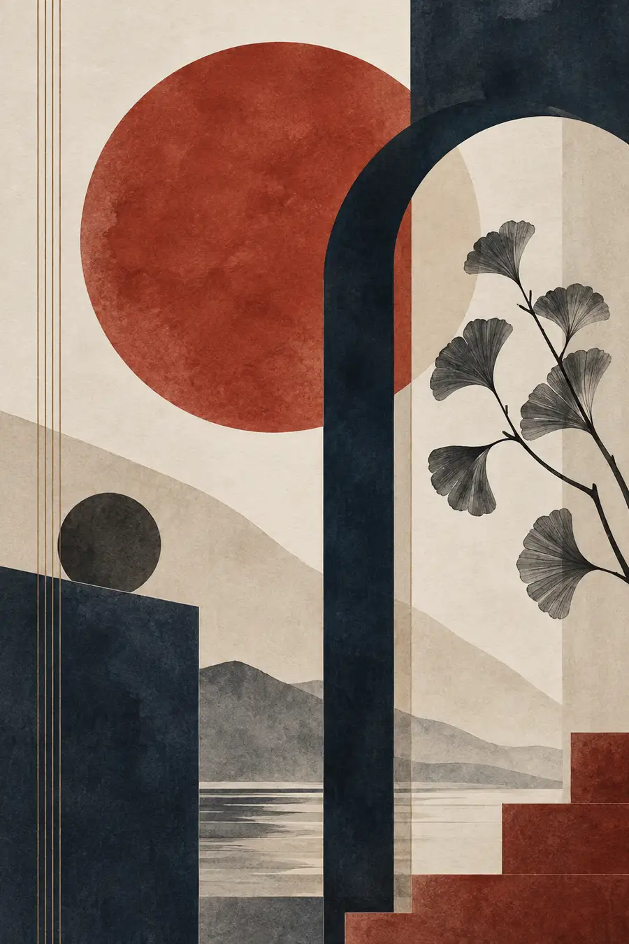
A large area might be broken up by a small line. A dark section gets a light counterpart. A circle deliberately doesn't sit exactly in the center. An arch partly disappears off the edge of the frame.
The eye automatically starts finishing the composition on its own.
And suddenly, a handful of shapes produces a surprising sense of depth.
Semi-transparent surfaces, varied plaster or paper textures, and slightly broken colors are what make these images interesting. From a distance, the artwork looks calm. Move closer, and you discover textures, small irregularities and different layers.
That's probably the nicest quality of good Japandi wall art: it doesn't get louder the longer you look at it — it gets more interesting.
Why Texture Matters So Much
A perfectly flat beige circle on a white background can quickly end up looking like a PowerPoint slide with design ambitions.
That's why Japandi needs materiality.
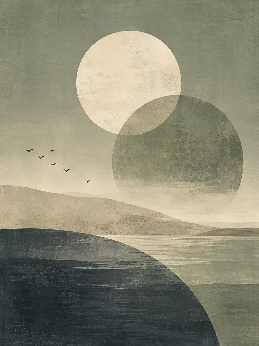
Paper texture, a linen-like finish, watercolor washes, a bit of grain, plaster texture, or deliberately uneven color edges bring warmth into the reduction. They keep minimalism from feeling sterile.
This is where the Japanese idea of wabi-sabi comes back in: small irregularities are often exactly what makes something interesting.
A surface can look as if it were painted with a wide brush. A color can be slightly cloudy. Lines don't have to look like they were drawn by an industrial plotter.
That gives the room something human.
Japandi Doesn't Actually Have to Be Beige
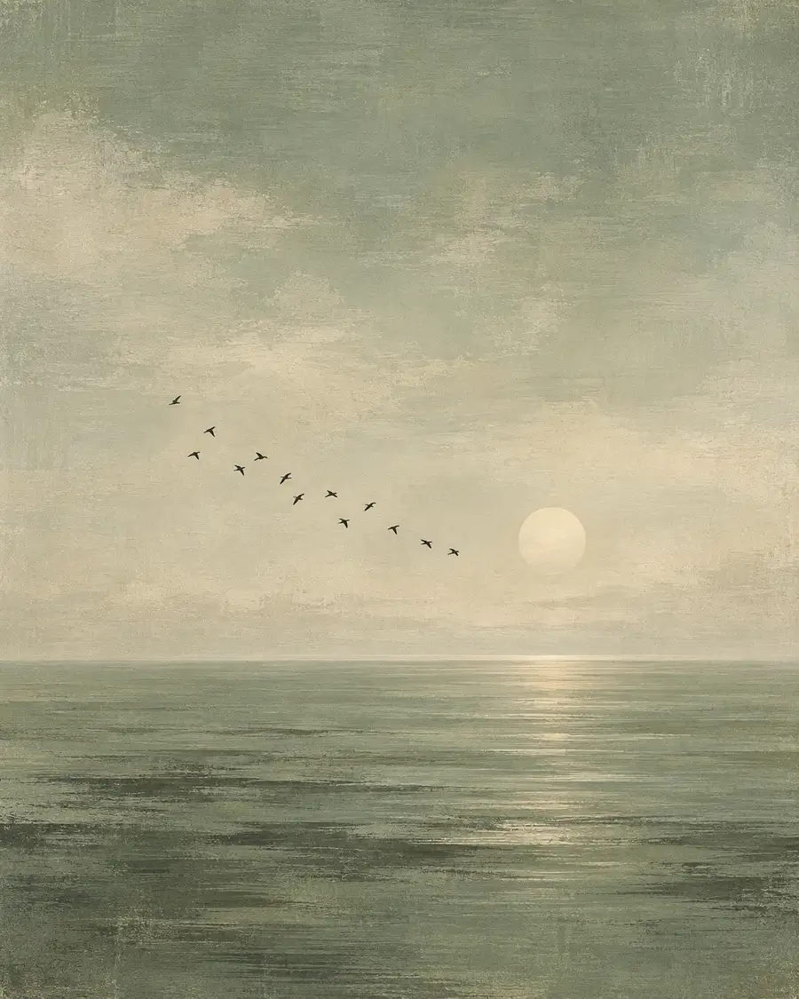
Maybe the biggest misunderstanding out there: Japandi means beige, more beige, and for variety, a slightly darker beige.
No.
The underlying idea works just as well with color.
Navy and emerald green can give a Japandi print real depth. Terracotta and mustard yellow bring in warmth. Sage green and lilac can look surprisingly elegant together. Red and navy create a much more graphic, almost architectural look.
What matters is less the color itself than its saturation and how it's combined.
A bright Ferrari red next to neon yellow gets difficult fast. A muted brick red next to warm ochre and natural beige, on the other hand, can work beautifully.
Japandi likes colors that look like someone gave them a little bit of dust and history.
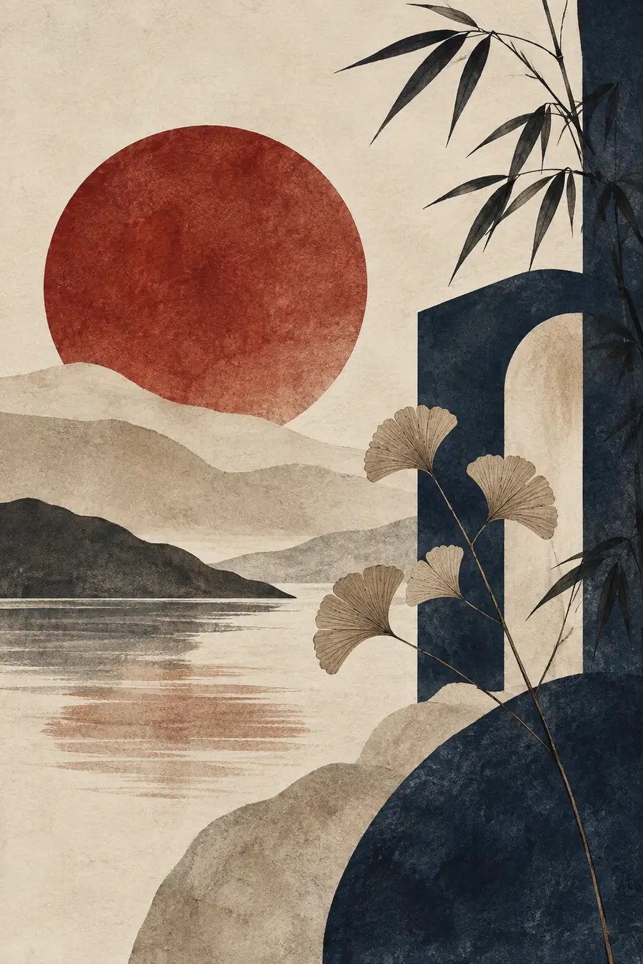
If you want to experiment with color yourself, our Japandi print collection ranges from muted beige all the way to navy blue and ruby red — all free to download.
Why These Prints Can Make a Room Feel Bigger
Large, calm surfaces create visual order.
In smaller rooms especially, one large Japandi artwork can work better than a wall full of small pictures. The space gets a single focal point instead of ten frames competing with each other.
Horizontal lines can make a room feel visually wider. Vertical arches emphasize height. Large circles set a clear focal point. Repeating geometric shapes can even pick up on architecture already in the room — round arches, windows, curved furniture.
The artwork isn't just decorating the room at that point.
It's organizing it.
And that's exactly why Japandi wall art works so well above sofas, sideboards, beds or dining tables. The furniture and the artwork start talking to each other, without anyone having to shout.
The Wall as a Point of Calm
Maybe that's ultimately why Japandi wall art feels so pleasant right now.
It doesn't ask anything of you.
You don't have to decode a motif. You don't need to understand an art-historical reference. You don't need to know a story.
A few shapes, some texture, a well-balanced color palette — done.
But when it's done well, a surprising amount still happens.
The room gains depth. The wall gains structure. Colors from furniture or rugs can be picked up and echoed. And among all the things we're forced to look at every day, a spot suddenly appears that's simply allowed to be calm.
You could say Japandi wall art is the art of making a room more interesting by asking less of it.
And sometimes, that's the biggest luxury there is.
Explore All Japandi Prints
21 free motifs to download and print — from calm beige all the way to navy blue and ruby red.
Browse Japandi Prints →